
back to home
Safe Place International

TDA Connect - Phase 2
A Safe Place for Community, Resources, and Growth


Project Overview
My Role
UXD 1 Apprentice
The Team
Project Team (2) Product Strategy (6) User Research (6) Content (6)
UXD 1 (7)
UXD 2 (7) Development (4)
Location
Remote
Timeline
April - June 2023
PROBLEM
The queer community from Uganda is facing serious threats, banning individuals from openly expressing their identities and connecting with other members.
Provide graduates with a dedicated space to build a strong community, share crucial resources & passion projects, and report instances of threats or violence.
GOAL
Phase 2 UXD 1 Focus
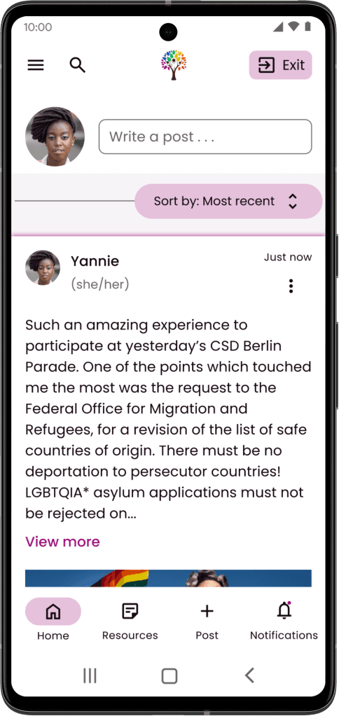
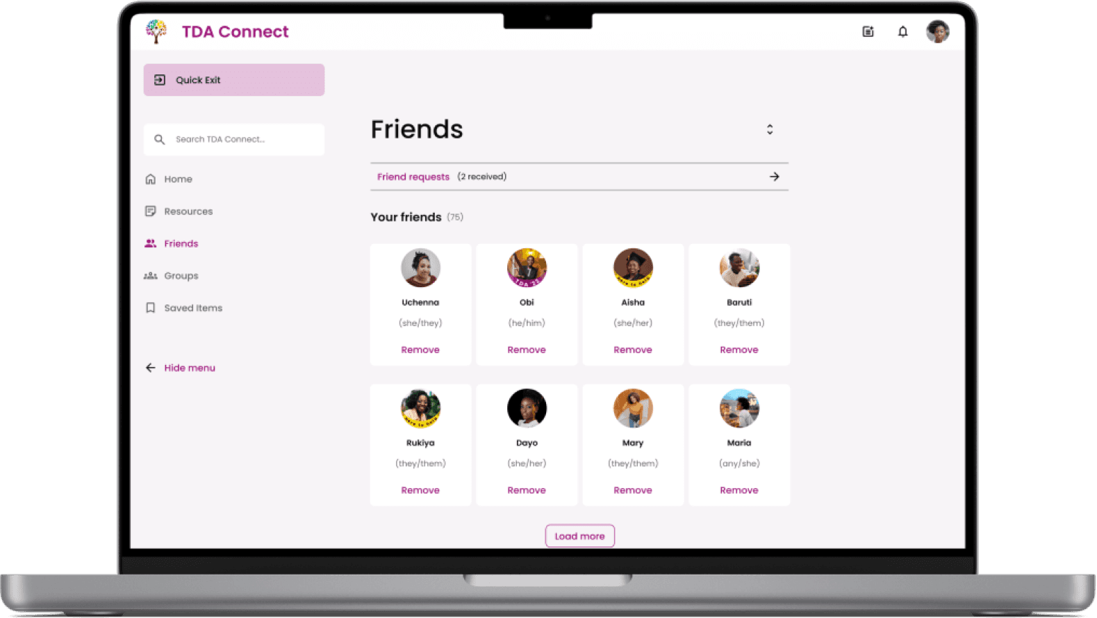
Social Feed
Friend Requests
Sign-up & Onboarding
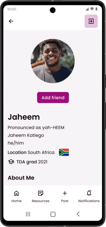
Profile
Notifications
Groups
One of my main focuses for this phase was the social feed with mobile-first responsive design.
For the purposes of this case study, we will looking at the design process through the mobile screens.
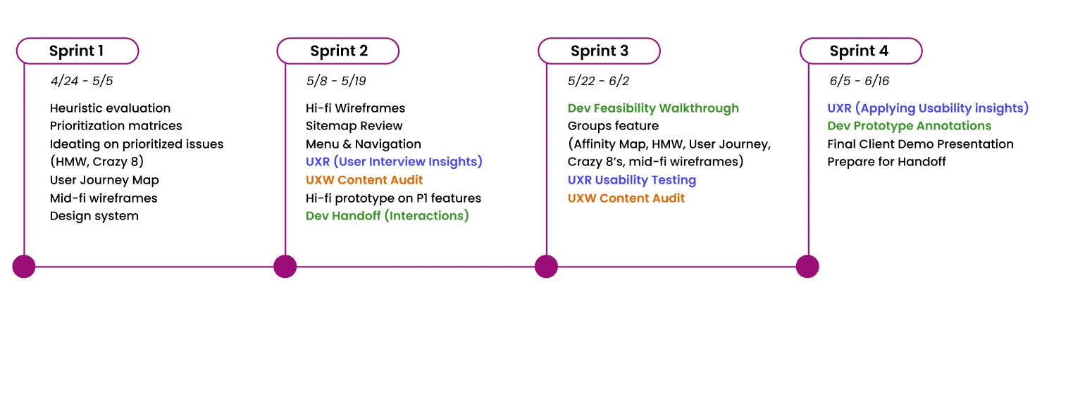
Agile Process Timeline
Our Solution
1
Connect with others
Interact with other users within the SPI community
Ability to add users and see common interests
Like, comment, & save posts
Kebab menu to simplify the design
2
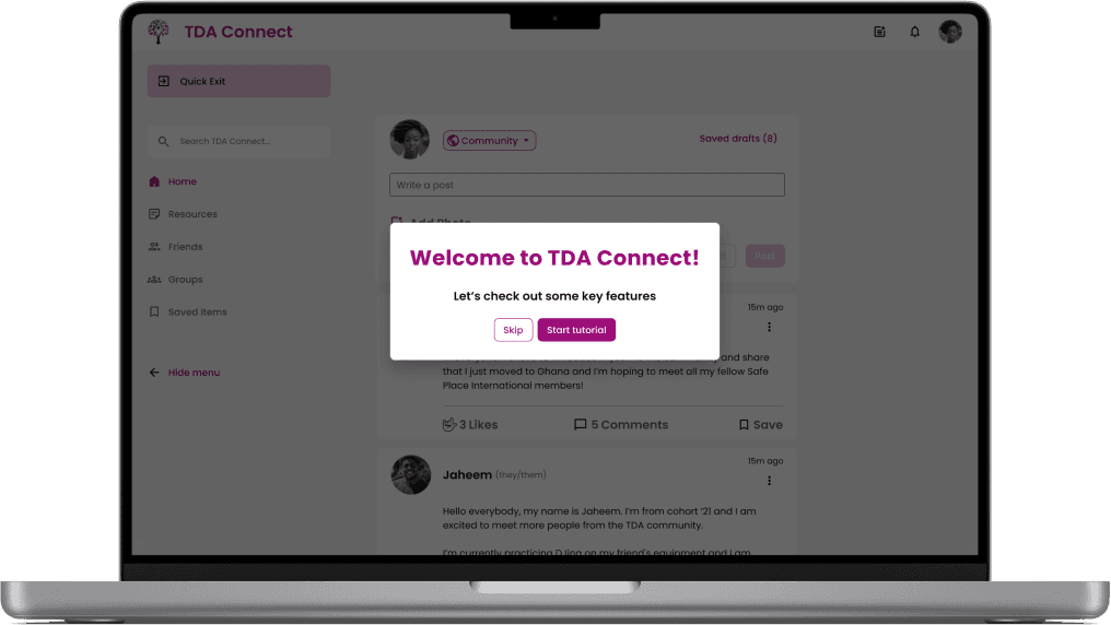
Quick Exit feature
Encrypted information
Sensitive Topics flagging feature
Report incidents
Add members of TDA community
Feel safe and secure
3
Auto-save drafts for any disruptions
Quick Exit
“Load More” feature to preserve data (vs infinite scroll)
Picture preview (click for full image)
Low-bandwidth features

Empathize - review - ideate - design - test & iterate
Understanding the User Needs
Client Goals

Cherri - SPI Organizer
“I want to create a platform for SPI members to connect, keep each other safe, and celebrate their accomplishments.”
User Goals
Community Connection
Share achievements
Share Resources
Interest based groups
Passion projects
Low-bandwidth
Save posts
reliable
Safety
Data security
Encryption
Community Trust
Report Feature
How Might We allow users to connect under low-bandwidth considerations?
CHALLENGE
Challenge: Meeting User Security Goals
As the team begun iterating on the reports feature based on the users’ pain points and experiences to design for safety, we were met with our first roadblock: limited resources.
The SPI organizer informed us that there wouldn’t be any moderators or actions they could take with incident reports due to a lack of funding, thus creating frustration on the users’ end.

User
I want a way to protect the community by reporting incidents. I feel safer when my voice is being heard.
We don’t have the capacity to take any direct action with the information from reports.
SPI Organizer


User
This is frustrating. What’s the point of reporting then? ...
This project really challenged me to empathize with users living in different contexts. For example, had the incidents been reported to our users’ local authorities in Uganda, they would be “outted” for being queer, and potentially prosecuted.
Next Steps
Our team decided to put a stop on developing the Reports Feature until the research and product strategy team had gained further research and insight on alternative approaches to the safety feature.
Empathize - review - ideate - design - test & iterate
Picking up where we left off
Who doesn’t love a good peer review? When we received the project’s previous designs, we began with a heuristics evaluation based on Jakob’s 10 Usability Heuristics.
To give you a little taster of what went down:
Heuristics Evaluation Feed Insights
The primary usability issues within the social feed included
“Create a Post” (mobile) screen - modal screen is not practical for the purpose of the user flow.
Sensitive Topics (all) - not all users know what this is. Consider a tooltip.
Error screen (all) - provide user with clarity when there is a connection error
Comments section (all) - order of comments is not intuitive. CTA button should be closer to the most recent comment (bottom)
Comments section (all) User should have ability to “hide” comments once they choose to expand the section
Kebab icon (all) find consistency in this icon (horizontal or vertical?)

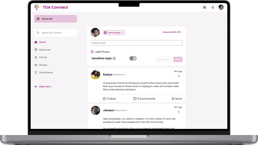
Write a post
Photo
Saved
Sort by:
Newest

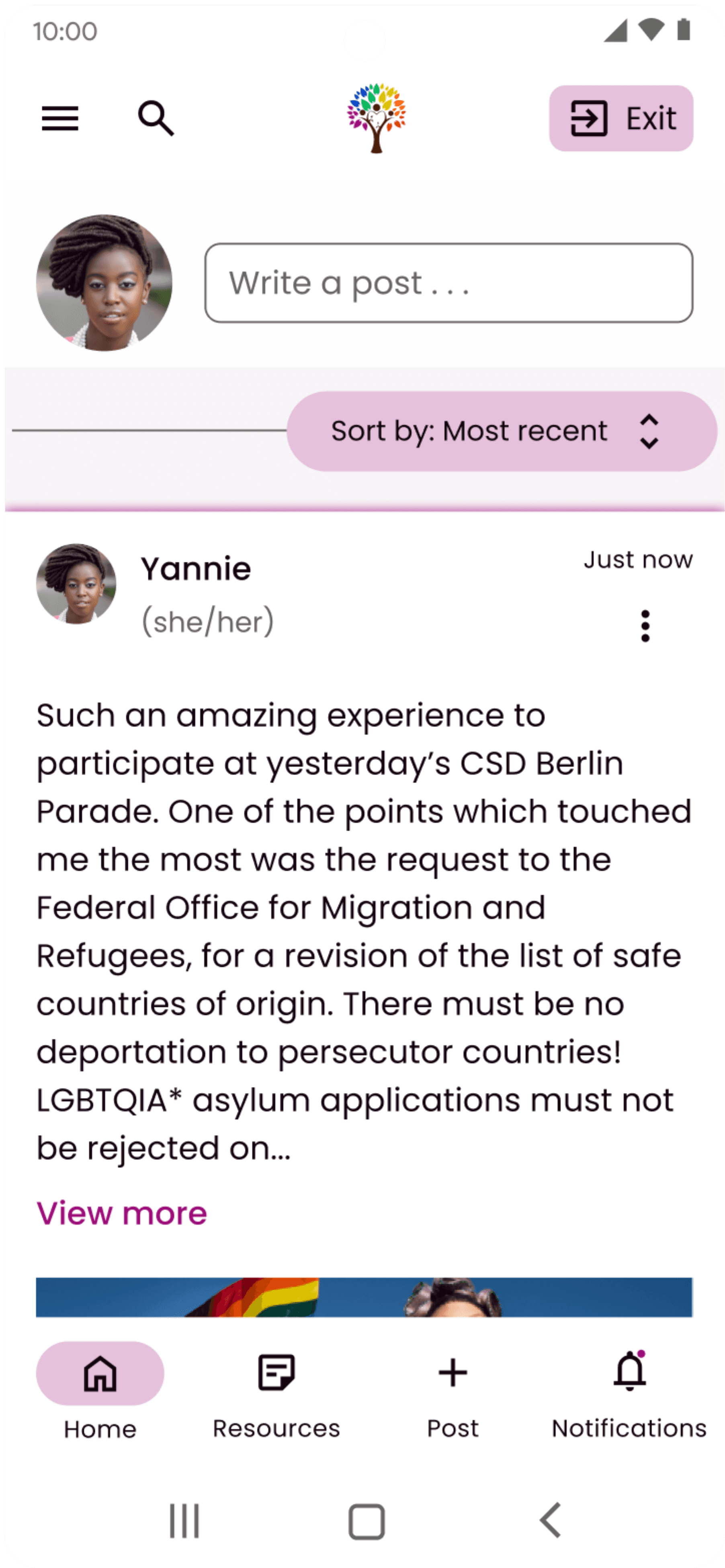
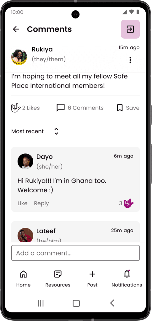
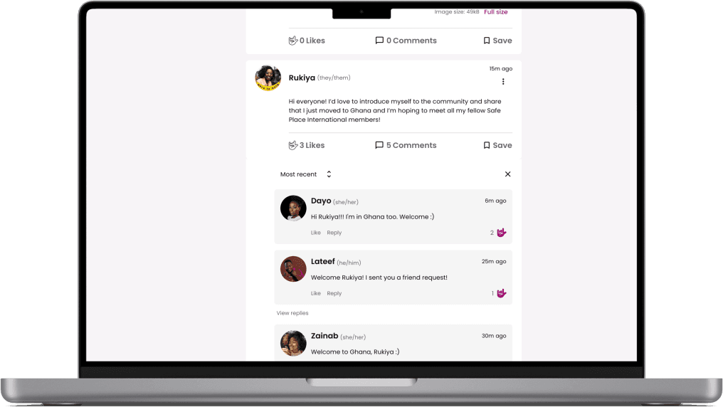
Rukiya
(they/them)
15m
Hi everyone! I’d love to introduce myself to the community and share that just moved to Ghana and I’m hoping to meet all my fellow SafePlace International members!
3
Likes
2
Comments
Like
Comment
Write your comment here.
Add comment

Lateef
(he/him)
6m
Welcome Rukiya! I sent you a friend request!
Like
1
Likes

Dayo
(she/her)
11m
Hi Rukiya!!! I'm in Ghana too. Welcome :)
Like
1
Likes

Zainab
(she/her)
7h
Hello hello! My name is Zainab and I couldn’t be happier to have joined this community! Looking forward to getting to know you all!
10
Likes
7
Comments
Like
Comment
Load more

Search
3
10:00
Feed
Reports
Profile
Settings

Save Draft
Post
New post

Public
Share your thoughts...
Add photo
Click here or drag file in the selected area.
no
Sensitive topic
10:00
Save Draft
Post
New post
Public
Share your thoughts...
Add photo
Click here or drag file in the selected area.
no
Sensitive topic
10:00
2
5
6
1
4
Journey Map
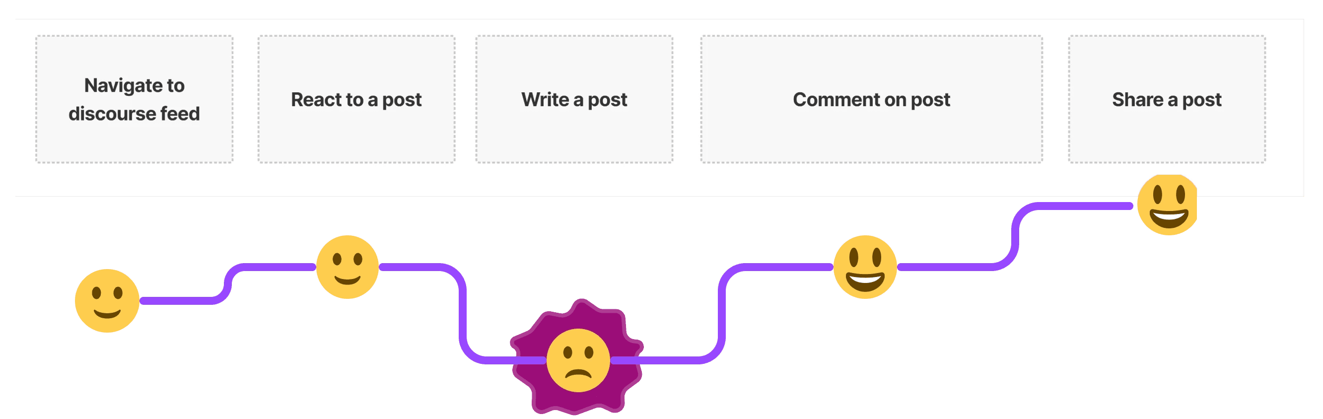
In addition to discovering improvement opportunities through a heuristics evaluation, we created a journey map to reflect on the general emotional experience of the social feed feature.
In this exercise, we uncovered the biggest task for improvement opportunities to be “Write a post”
View full journey map here
Write a post - Improvement Opportunities
Audience Selection: Give users the opportunity to choose who they want to share the post with. They could choose to write a personal post, a post which is visible to everybody, to their friends, or in a specific group or channel.
Save Draft: Give users the possibility to save a draft, maybe also auto-save? (could be helpful for low bandwidth)
User Flow - Social Feed, Create a Post
Once we summarized the insights from both the Heuristics Evaluation and Journey Map exercises, our team began reviewing and revising the flowchart to reflect additional mobile screens in the Write a Post process.

Empathize - review - ideate - design - test & iterate
Crazy 8 Sketches
Based on the heuristic evaluation insights, we begun ideating solutions for each of the features. Then, our team collaborated virtually to present each of our sketches, and spend 15 minutes on voting.


Empathize - review - ideate - design - test & iterate
Internal Team Communications
UXD 1 Voting Page
Within the figma file, we created a voting page to collected feedback from our teammates.

Voting Process
STEP 1
Individual teammate posts design/designs on Voting Page along with annotations for context.
STEP 2
Teammates may vote using the “poll”, leave comments, ask for clarification, or “star” the feature that they like.
STEP 3
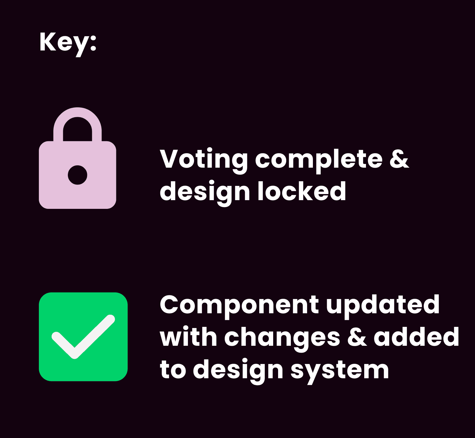
Original poster utilized the voting key to “lock” a design.
STEP 4
Component is added/edited within the design system.
FUN FACT -
The UXD 1 team voted on a total of 113 instances!


Empathize - review - ideate - design - test & iterate
From Midfi to Hifi Designs
Throughout the first two sprints, our designs were heavily influenced by our collaboration.
UXD 1 (Our Team) - Voting Process
working asynchrously to give/receive feedback on designs
UXR - Usability Test
Helping conduct usability tests along with implementing insights from UXR
Content - Content Audit
Passing our designs to content to conduct a content audit based on branding and design system consistencies.
Dev - Feasibility Walkthrough
Demonstrating the prototype with dev through a meeting & handing off our design file with interaction annotations.
3 Major Design Iterations
In order to validate the success of our designs, we made sure to revisit the user pain points -
Community
connection
Low-bandwidth
Safety
#1: Users want a quick to interact with other members

#2: Write-a-post bandwidth features

#3: Users want a simple way to interact with posts

Menu & Navigation Updates
After taking a moment to appreciate our hifi screens, time to snap back to reality and realize that our navigation only had 2 tabs! Time for some MAJOR updates to the menu and navigation.
Mobile Menu & Navigation


Desktop Menu & Navigation
Before

After

Design System
Organizing the design system involved heavy collaboration between UXD 1, UXD2, and Content. Based on Content’s research on branding and tone, we wanted to align the UI along with SPI’s branding, thus keeping in mind
Encouraging
Professional
Inclusive
Empathetic
Concise/Simple
I could show you a sample of our final design system, but just glancing over the sheer amount of effort it took to reduce the initial design system would not be serving our team justice.
Design System Overhaul
In order to reduce the # of instances, our team researched different Figma design properties (variant, boolean, instance swap, & text). Another tool that our team used to reduce the number of instances was auto-layout, which allowed for responsive buttons.
Before
(Phase 1 Design System)

After
(Phase 2 Design System)
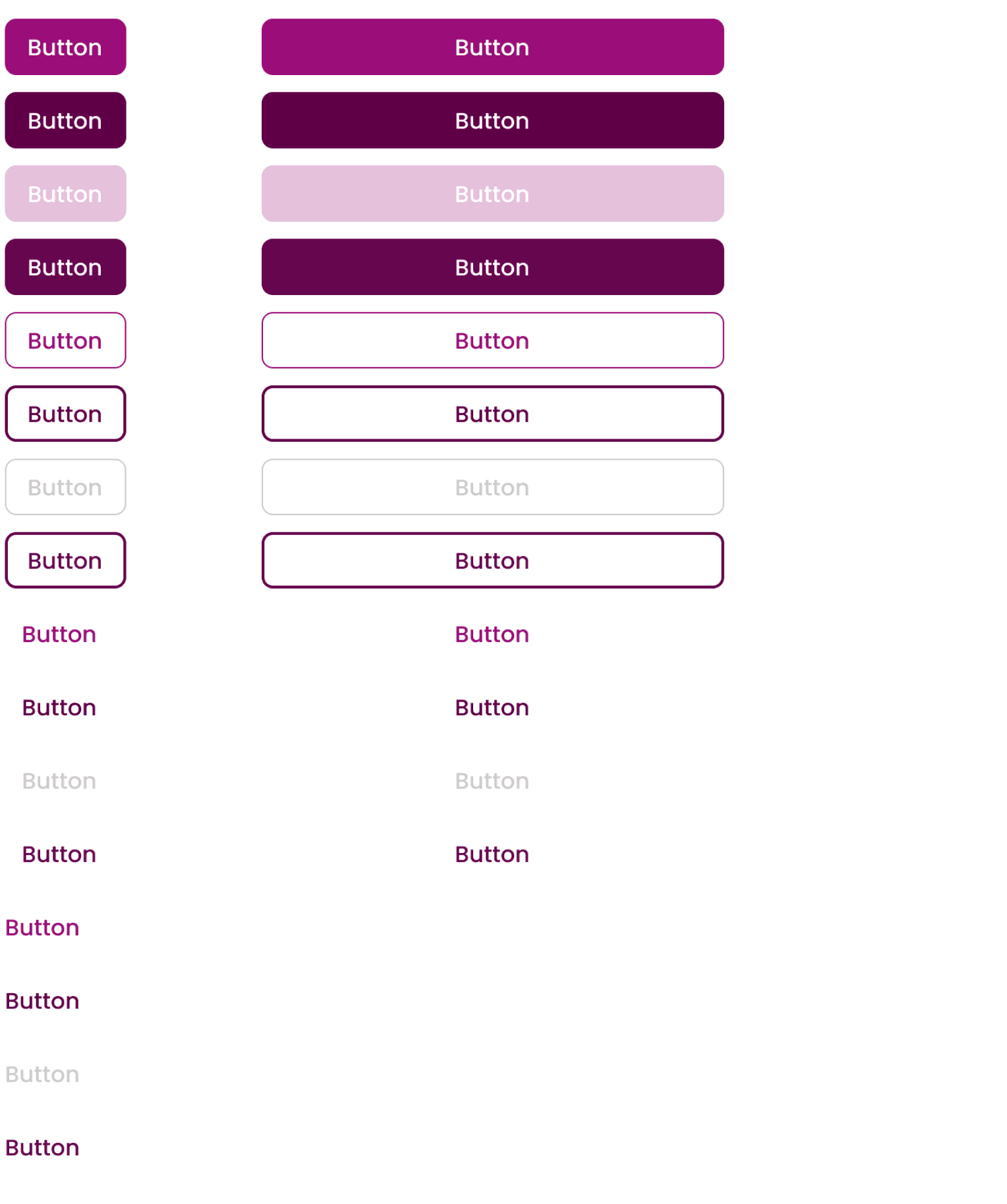
372
fewer component instances!
Safe Place International
TDA Connect - Phase 2


Mobile Screens
Desktop Screens


Additional Challenges
In addition to the reports feature setback, our collaboration with UXR & Dev revealed several challenges.
Low-bandwidth limitations
Our continuous collaboration with the development team throughout this phase had revealed several challenges including the features:
Global site search, Select friends feature, & photo media.
As a temporary solution, we have decided to get rid of the select friends - audience setting. In addition, the search icons would represent a page specific search, rather than a site-wide search.
SPI moderators & anonymous feature
In Phase 2, we conducted client check-ins after each of the four sprints. During the development of the social feed, user interviews suggested adding an anonymous posting feature to protect user identity and sensitive information. However, we recognized the potential risk of misuse, such as hate speech or exposing private information. To ensure safety, active moderators would be necessary to oversee the posted content. As revealed in the Reports Challenges section, SPI did not have the capability to have a strong moderator presence.
Usability testing setback
We partnered with UXR to help conduct usability tests of our prototype.
Although we had anticipated taking one week to complete all the tests, our participants in Uganda had unforeseeable environmental circumstances that prevented them from joining us virtually some days. Thus, we weren’t able to retrieve usability test insights until 2 weeks later.
Next Steps
Recommendations for Phase 3
Low-bandwidth setting
Phase 2 revealed that the main challenges were low-bandwidth restrictions, making it tricky to balance usability with data-intensive features. Thus, we explored the option of adding a low-bandwidth setting to cater to users with limited internet connectivity
#Tagging feature
Being able to sort through information would help mitigate social feed pain points. A tagging feature would allow users to discover posts based on content rather than member profile/general feed.
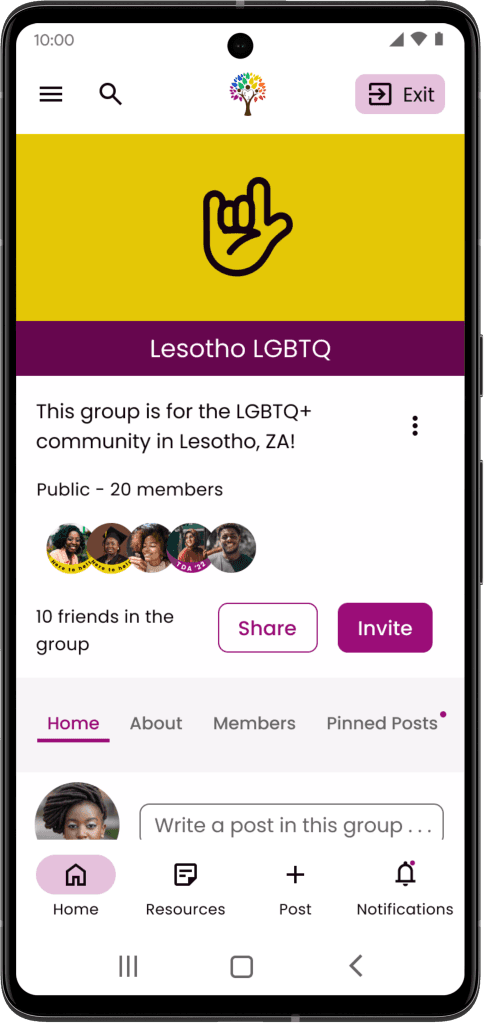
Groups feature (admin screens)
Creating a group implies having an admin position. The non-admin screens are already built. The admin perspective will include a group settings screen and additional controls for interacting with group posts.

Takeaways
Don’t mess with ‘da system...
Throughout the design process, we learned the hard way how updating the design system without notifying others’ could result in a painful recovery design process.
As the UXR team started usability testing, our team rushed to continue working on the design system. This led to several issues in the usability tests, with some updated components resetting their instances & resulting in incomplete prototype links.
In the Phase 3 recommendations, I highly suggest the next team to spend longer time onboarding new teammates to the Design System expectations.
Continuous collaboration
Though our team successfully collaborated with other teams at a high product level, there were a few setbacks throughout the phase due to the periods of time of not meeting with other teams. Having a cross-team liaison for each team’s meetings to represent each of the teams would help navigate this challenge.
Have a communication plan
Where can you view your weekly tasks? Is there an organization method? What would Priority 0 tasks look like? How do you communicate with your own team and other teams? These are all things we learned throughout the process. However, having a method of communication sooner than later would have solved a lot of problems faster!